


Black Hatch®
Coffee Roasters
Brand ID & Packaging Design
México 2023
(Español)
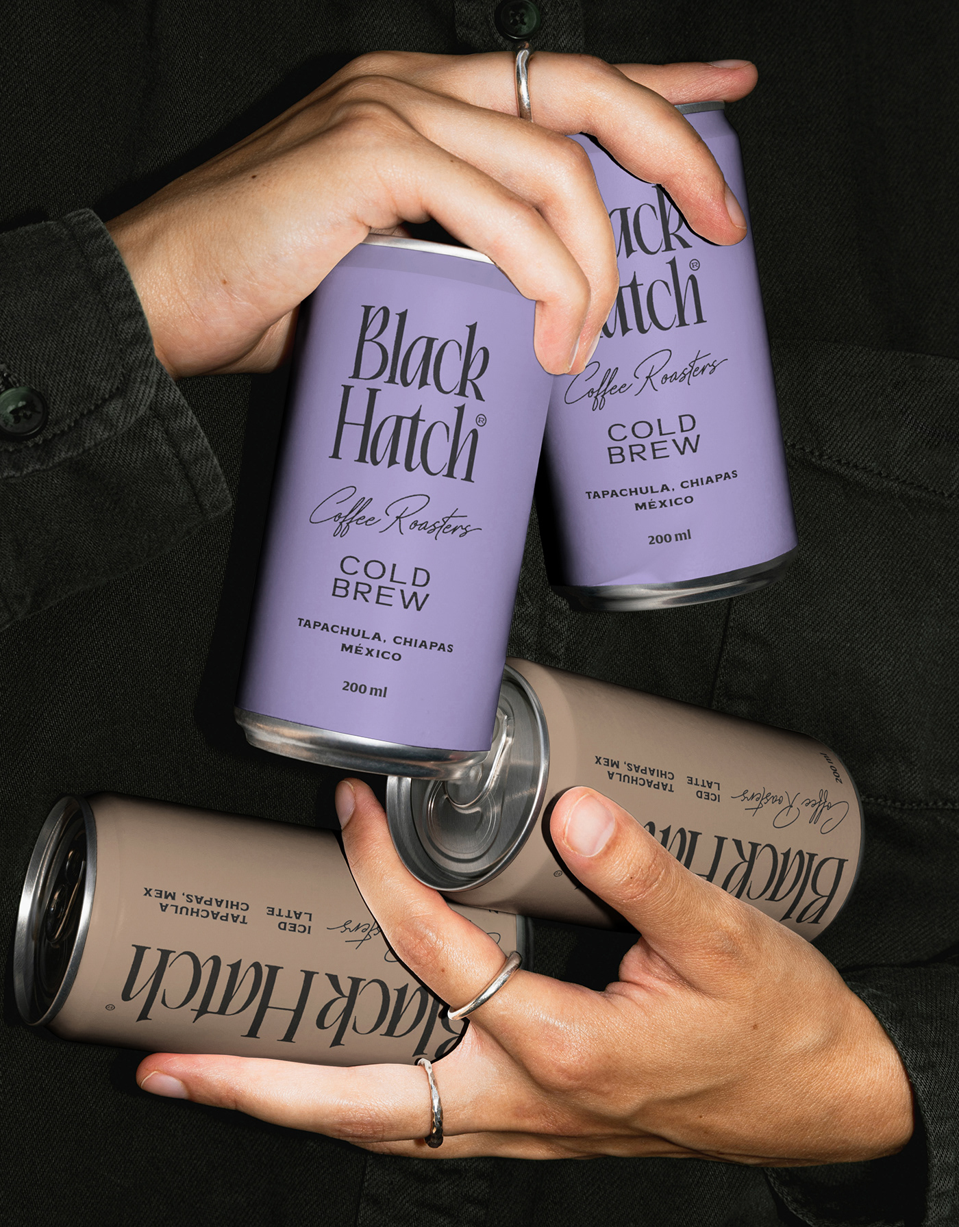
Black Hatch, originario de Tapachula, Chiapas, México, comenzó como un proyecto de venta de café en grano y molido de alta calidad. Con miras a expandirse, la marca planeó lanzar dos nuevos productos: cold brew y café helado enlatado. Nuestro reto fue desarrollar una identidad y sistema visual que integrara tanto los productos existentes como los nuevos. Buscábamos alejarnos del estilo convencional y artesanal predominante en la región, creando una marca con personalidad y amplitud. El objetivo era cumplir con estándares visuales estéticos y funcionales, fácilmente reproducibles en diversas aplicaciones, y comunicar la calidad del producto de forma amigable y distintiva.
Mi inspiración para crear la ilustración del gallo negro surgió de imaginar cómo me gustaría que me despertara el gallo que oigo por las mañanas, no con su incesante canto que comienza desde las 3 a.m. (a veces lo escucho incluso a esa hora), sino de una manera más amena. Por eso, en lugar de patas, le dibujé piernas, representándolo corriendo con una taza de café calientito en la mano, como un despertar ideal con café recién hecho.
En el aspecto tipográfico, rediseñamos una fuente serif para proyectar la esencia y la pasión por el detalle, reflejando la variedad de productos con notas y sabores que invitan a un viaje multisensorial. Las formas orgánicas del wordmark conservan la tradición y garantizan la calidad excepcional del café. Este enfoque resultó en una identidad de marca renovada para Black Hatch, que combina tradición e innovación, manteniendo una conexión profunda con sus raíces mientras avanza hacia un futuro emocionante en el mundo del café.
(English)
Black Hatch, hailing from Tapachula, Chiapas, Mexico, started as a venture selling high-quality whole and ground coffee. Planning to expand, the brand aimed to launch two new products: cold brew and canned iced latte. Our challenge was to develop an identity and visual system that would encompass both existing and new products. We aimed to move away from the conventional and artisanal style prevalent in the region, creating a brand with personality and breadth. The goal was to meet aesthetic and functional visual standards, easily reproducible across various applications, and to communicate the product's quality in a friendly and distinctive manner.
My inspiration for creating the illustration of the black rooster came from imagining how I would like to be woken up by the rooster I hear in the mornings, not with its incessant crowing that starts as early as 3 a.m. (sometimes I hear it even at that hour), but in a more pleasant way. Therefore, instead of claws, I drew it with legs, depicting it running with a steaming cup of coffee in hand, symbolizing an ideal wake-up with freshly made coffee.
In terms of typography, we redesigned a serif font to project the essence and attention to detail, reflecting the variety of products with notes and flavors that invite a multisensory journey. The organic shapes of the wordmark preserve tradition and ensure the exceptional quality of the coffee. This approach resulted in a renewed brand identity for Black Hatch, merging tradition and innovation, maintaining a deep connection with its roots while moving towards an exciting future in the coffee world.
Project Concept, Art Direction, Graphic Identity, Illustration & Packaging: Moisés Guillén (Moises Visuals™).
Commissioned by: Ernesto Serna (Sr. Brander).


